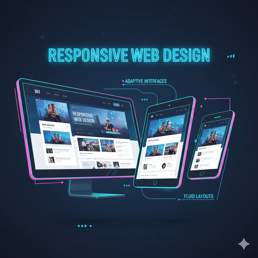
Responsive Web Design is an approach to building websites that automatically adjust their layout, content, and functionality to fit any screen size or device. Whether someone visits from a desktop, laptop, tablet, or smartphone, the website reorganizes itself to deliver the best viewing experience. This includes flexible grids, scalable images, and adaptive navigation that work smoothly across all devices.